
It’s All About the Details
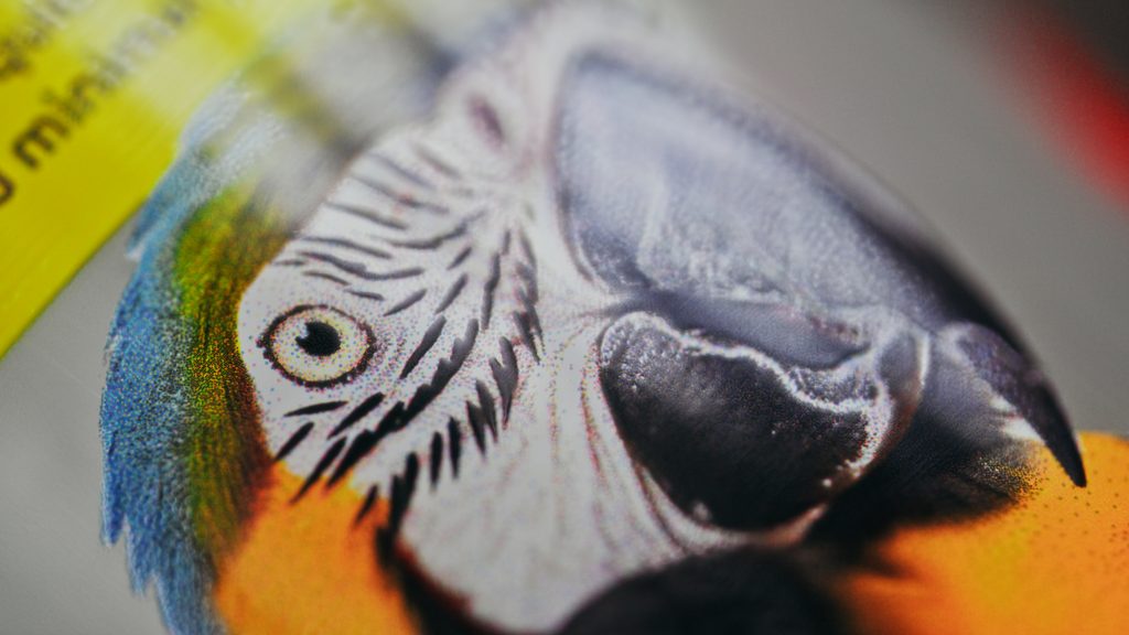
The difference between a standard print and a photorealistic one often lies in the smallest details. Gradients transition smoothly, skin tones appear natural, and subtle shadows and textures are faithfully reproduced.
Colour accuracy is equally important. Whether in cosmetics, beverages, or a healthcare, consumers expect packaging to look perfect, but also identical from one production batch to the next. Maintaining that consistency is just as important as achieving high image quality.
More Than Just Resolution
It’s easy to assume that higher resolution automatically means better print quality, but that’s only part of the equation.
Photorealistic printing depends on many factors working together, including colour management, ink behaviour, substrate compatibility, printhead precision, registration accuracy, curing technology, and process stability. When these elements are optimized, the final result closely matches the original artwork and delivers a premium visual impact.
Why It Matters
Packaging is often the first interaction a consumer has with a product. High-quality decoration communicates attention to detail, reinforces brand identity, and enhances the perception of quality before the product is even opened.
As brands compete for attention both on the shelf and online, premium print quality has become a powerful differentiator. Even small improvements in image reproduction can significantly influence how a product is perceived.
Creativity Without Compromise
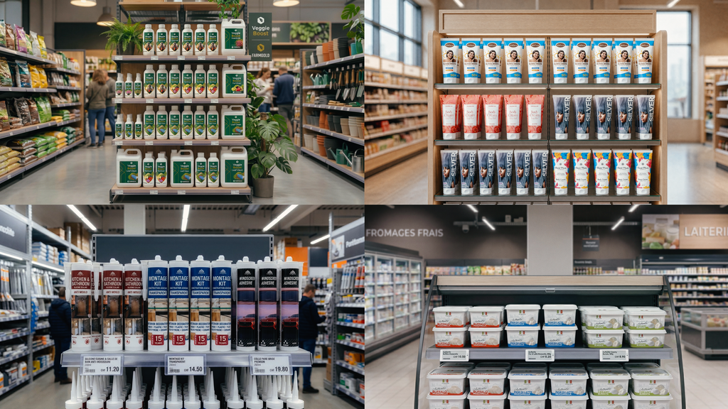
Every package begins with a designer’s vision. The challenge is reproducing that vision accurately and consistently on the finished product, regardless of its shape, material, or production volume.
Photorealistic printing is about bridging the gap between creative intent and industrial production. When technology can faithfully reproduce every detail of a design, packaging becomes more than decoration, it becomes an extension of the brand itself.